Muneeb Qazi

MEATER Web
& E-Commerce Platforms

Apption Labs manages MEATER’s global online presence, including MEATER.com, e-commerce stores, and the Amazon brand store, driving UX improvements and business growth.

Overview

At Apption Labs, I redesigned the brand website, Shopify, and Amazon stores, improving usability, accessibility, and mobile performance. Testing and feedback boosted satisfaction, conversions, and revenue. meater.com | store-uk.meater.com

ROLE & RESPONSIBILITY

UX Designer & Developer
Redesigning Web Platform, Design System, UI Implementation
Apr 2023 – Present

Main Objective / Project Goals

To redesign MEATER’s brand website and eCommerce store into a cohesive, responsive, and user-focused digital experience. The aim was to clearly communicate the brand’s premium value, improve product discovery, and reduce friction in the shopping journey. Success meant creating a seamless user flow from education and engagement to purchase, while addressing checkout drop-offs and ultimately driving higher conversions and stronger brand trust

Design Process

Competitive Analysis

Key User Interview Insights And Internal Feedback

User interviews revealed the need for faster filtering, better product information, and easier access to support content to build trust. Users also reported checkout friction leading to cart abandonment. Stakeholders aimed to reduce third-party platform dependency, support multi-region sales, and lower checkout drop-off rates, while also addressing weak brand communication that affected trust and perceived value. These combined insights guided the prioritization of features to improve usability and reinforce MEATER’s premium, innovative brand image in line with business goals.

Strategy & Definition

Information Architecture

The website and eCommerce store were restructured with a clear, intuitive hierarchy, organizing content into primary and secondary navigation, a simplified checkout flow, and quick‑access links. This improved usability, streamlined the path from discovery to purchase, and ensured easy access to key information.

Journey Mapping

Design Process & Iteration

SKETCHES & WIREFRAMES

Preliminary sketches explored layouts for the MEATER website and eCommerce store, focusing on navigation, product discovery, and checkout flow.

Low-Fidelity Design

Created low- to mid-fidelity wireframes for the website and eCommerce store, mapping layouts, product pages, and checkout flows to guide design and usability testing.

Brand Website Lo-Fi's & Mid-Fi's

Ecommerce Shopify Store

Amazon Store

Branding And Visual Direction

Defined the visual language, including colors, typography, and imagery, to reflect MEATER’s premium brand identity while ensuring consistency across the website and eCommerce store.

Hi-Fidelity Design

Developed high-fidelity designs with final visuals, branding, and interactions, showcasing the polished look and feel of MEATER’s website and eCommerce store.

Brand Website

Ecommerce Shopify Store

Amazon Store

Usability Testing

Usability testing was conducted with five participants representing MEATER’s target users—tech-savvy cooking enthusiasts and early adopters of smart kitchen gadgets. The goal was to evaluate both the existing MEATER.com experience and the redesigned high-fidelity prototype, focusing on ease of navigation, product discovery, eCommerce store usability, and checkout flow, as well as clarity of brand messaging.

Scenario:
“Imagine you’re looking to purchase a smart meat thermometer that fits your cooking style. Explore the MEATER store, find product information, compare models if needed, add a product to the cart, and proceed through checkout. Share how confident you feel in the brand and your decision to complete the purchase.”

Results and Insights

Users found the navigation menus overwhelming, with unclear paths to key product and store pages, disrupting the purchase and checkout flow.

Product details were scattered, with no easy product comparison or cross-selling options, making it harder for users to evaluate products and accessories.

The visual design failed to consistently convey MEATER’s premium, innovative identity, while recipe and support content, though valued by users, was poorly integrated into the shopping journey, reducing trust and making it harder to connect the brand’s value with purchase confidence.

User Behaviour & Analytics Insights

Following usability testing, we supplemented qualitative feedback with real user data to better understand behavior and pain points during the purchase journey. Insights provided by the marketing team on high checkout drop-off rates particularly users abandoning after adding products to the cart, were instrumental in focusing our efforts.
Using tools like Hotjar, we analyzed session recordings and click heatmaps to observe where users hesitated or dropped off during checkout. Additionally, Microsoft Clarity helped us study user interactions in detail, including scroll behavior, rage clicks, and engagement on critical pages like the cart and checkout.
Clarity’s heatmaps revealed that user attention was heavily focused above the fold, with minimal interaction on content lower down the pages. This highlighted the importance of placing key product information and calls to action in immediately visible areas to encourage deeper site exploration and improve conversion rates.
These combined insights directly informed design improvements targeting friction points in the store, cart, and checkout experience, aligning with business goals to reduce abandonment and increase revenue.

Iteration & Design Improvements

Simplified Navigation Structure

The navigation menu was redesigned to be clean and straightforward, featuring clear categories and a prominent CTA button linking directly to the Shopify store. A side navigation panel was also introduced, listing all products, support pages, contact details, and social media links, enabling users to easily find information and move smoothly through the purchase journey.

Enhanced Brand Consistency and Premium Visual Identity

The redesign established a cohesive visual language that reinforced MEATER’s premium, innovative positioning. A dark theme paired with a refined color palette, modern typography, and clean layouts created a polished, high-end aesthetic. High-quality product visuals, lifestyle imagery, and concise, benefit-driven copy (“Cook With Confidence”, “Precision Calibration”) were strategically integrated to communicate innovation and trust. Bold imagery and consistent typography were applied across all key pages, while CTAs were standardized in style and placement for stronger conversion cues. 

Enhanced Product Structure and Cross‑Selling


Products were organized into Alpha Collection (legacy) and Pro Collection (next‑gen) for clearer navigation. A “Personalize Your Product” engraving option was added for gifting and customization. Comparison tables and related accessories sections, including “Pair Your MEATER With”, were introduced to simplify evaluation and encourage cross‑selling, while concise feature layouts improved decision‑making and purchase confidence.

Streamlined Cart Page & Checkout

The cart and checkout pages were redesigned with a simplified, intuitive layout, making the path to purchase clearer and faster. Apple Pay, Google Pay, and other third‑party payment options were added to facilitate quick checkouts. A clean cart page now guides users seamlessly to checkout, replacing the previously confusing flow.

Outcomes & Results

The redesign of MEATER.com and its eCommerce store resulted in a clear uplift in business performance, with a notable increase in checkout success rate and overall conversions. By streamlining navigation, enhancing product presentation, and optimizing the checkout flow, users were able to complete purchases more easily, leading to reduced cart abandonment. Improved visual hierarchy, premium branding, and integrated comparison and cross‑selling options also boosted user engagement, product discovery, and trust.

In Progress

The post‑purchase journey is currently being designed to enhance customer experience with features such as order tracking, delivery updates, and proactive notifications. Low‑fidelity wireframes have been created and are now in the testing phase to gather user feedback, which will inform the next iterations before moving to high‑fidelity designs and development.

Final Takeaways

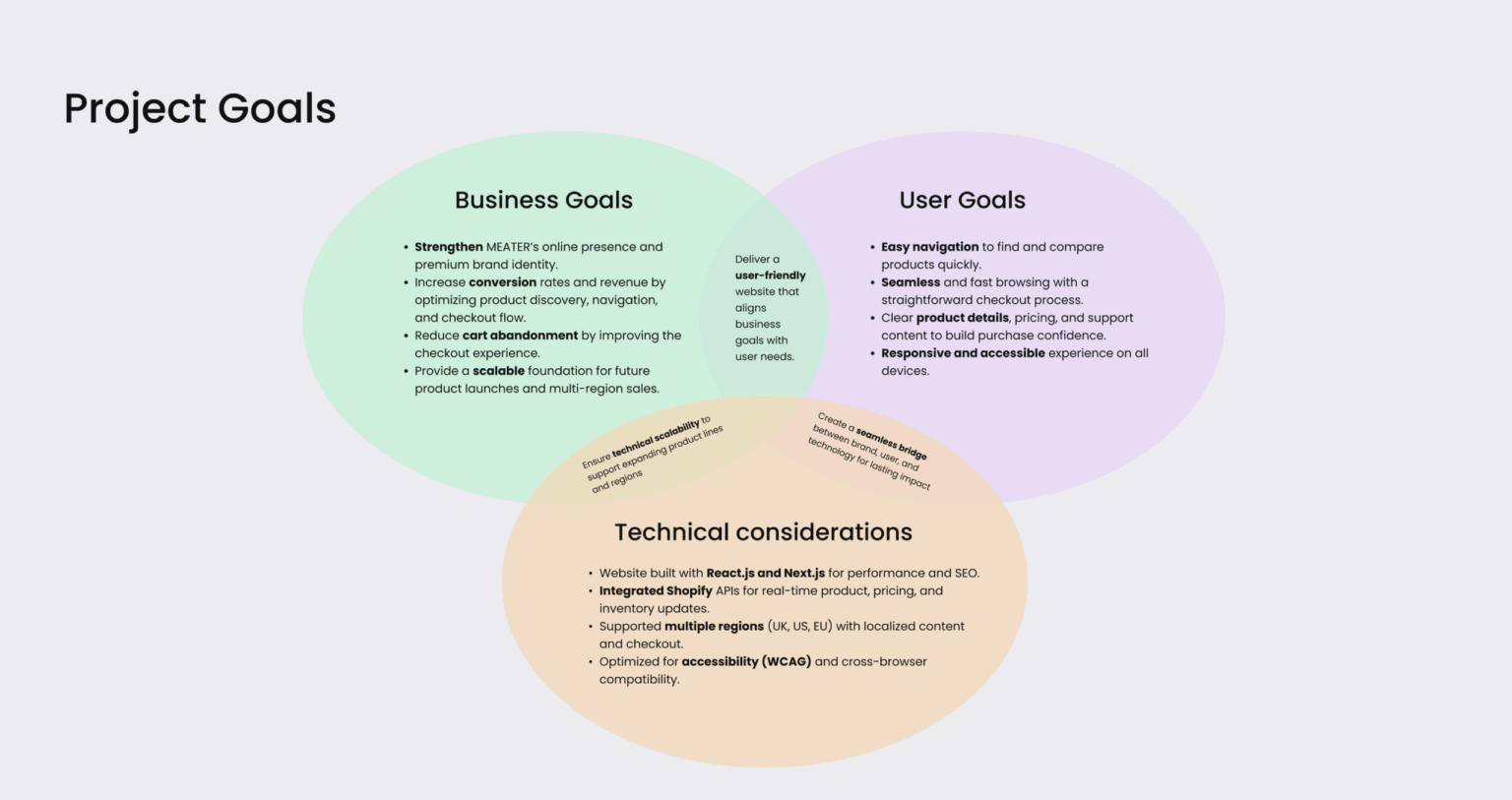
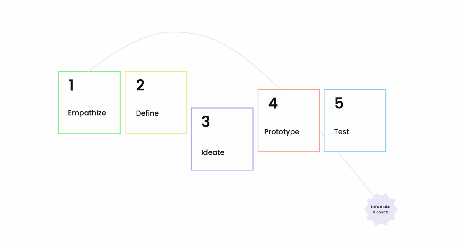
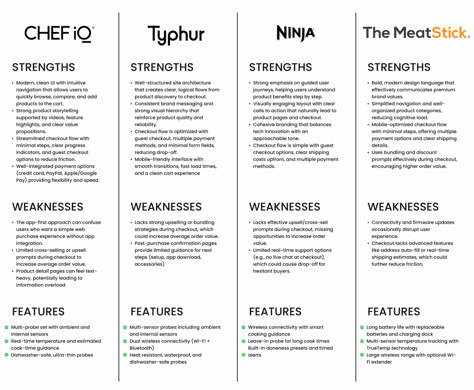
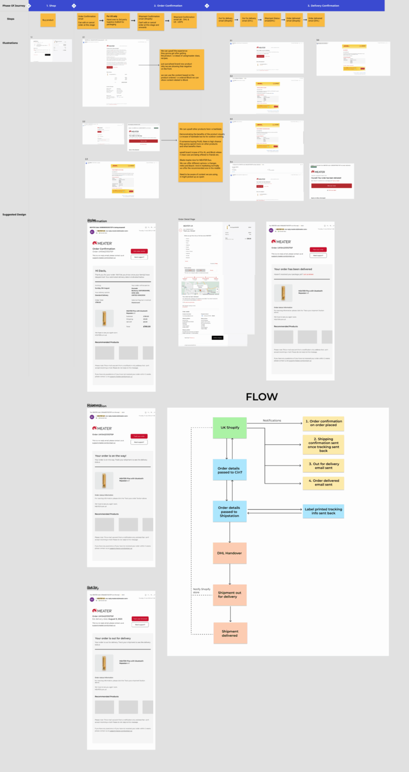
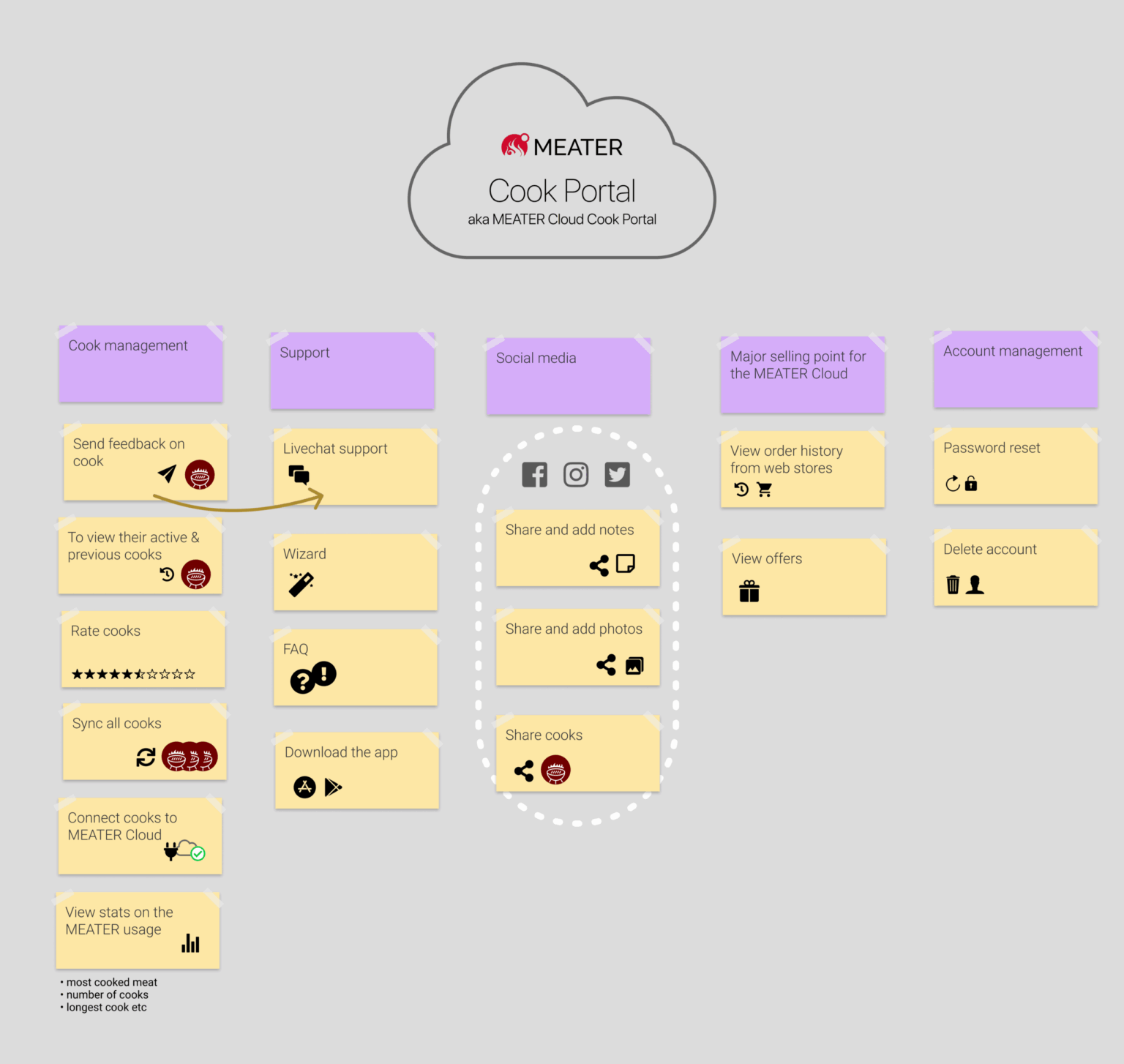
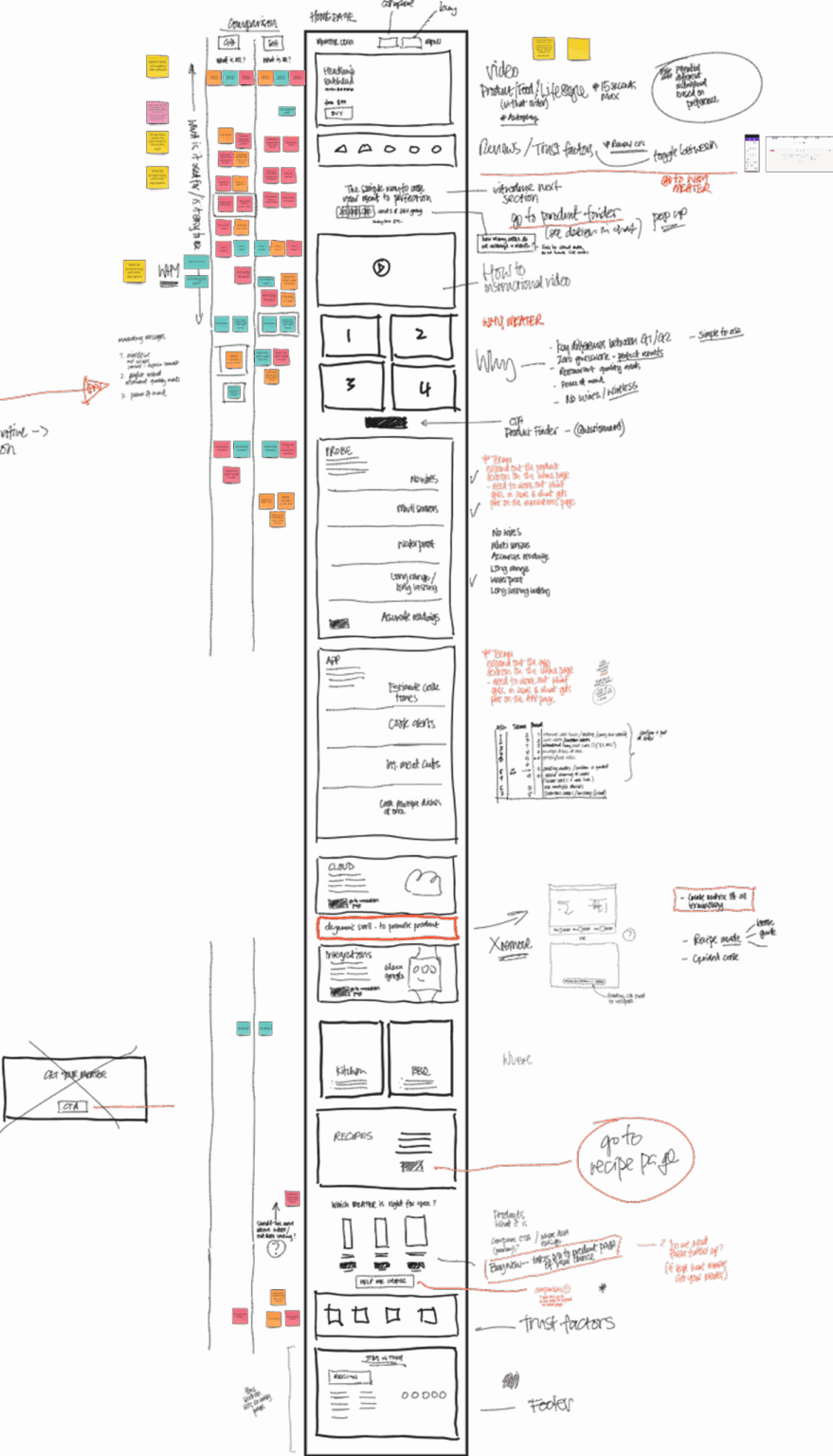
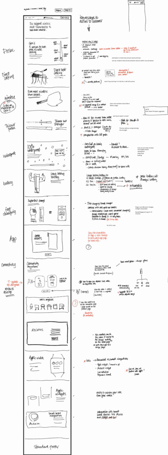
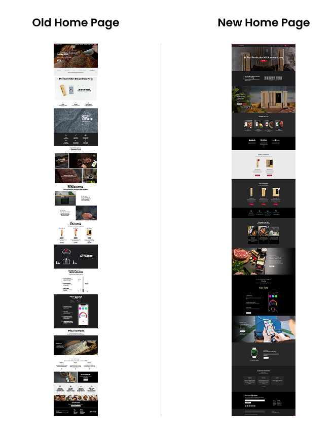
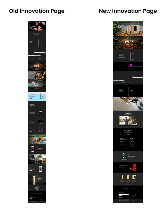
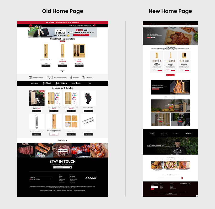
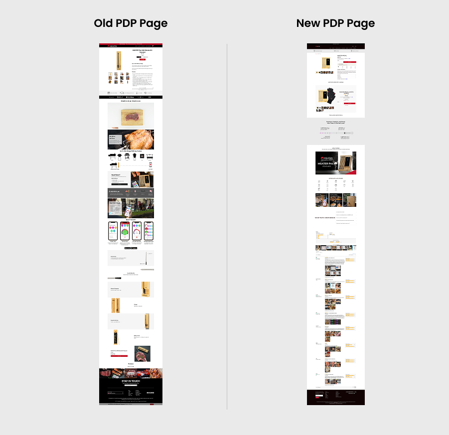
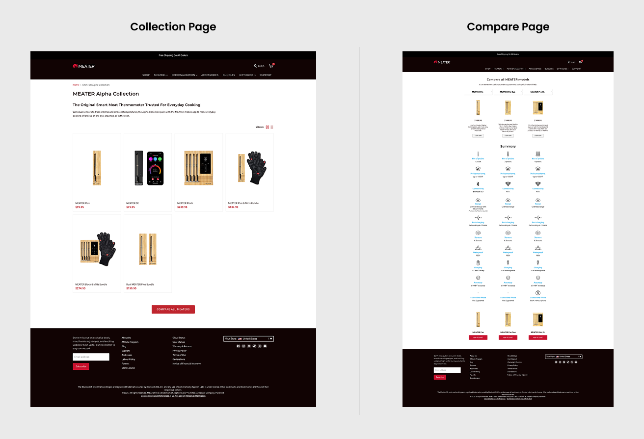
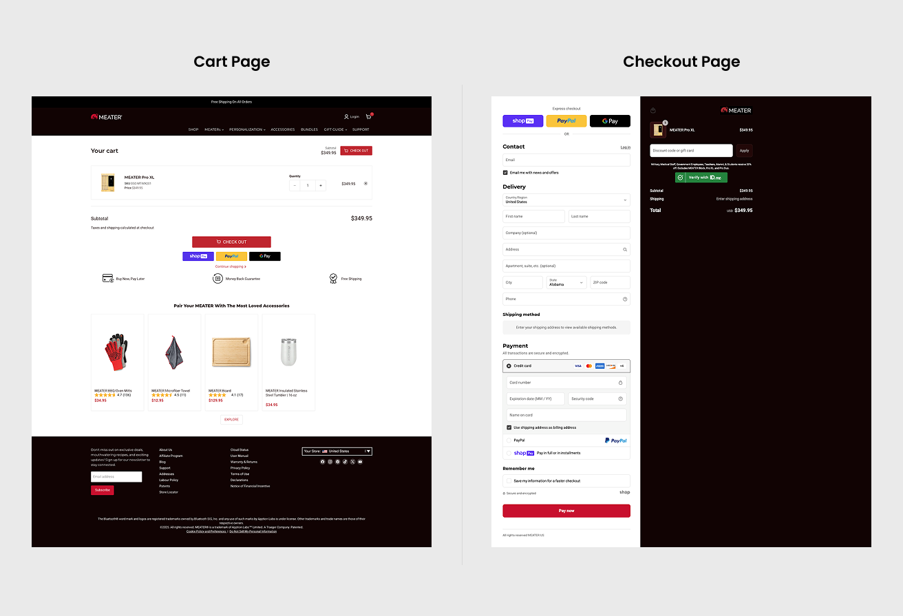
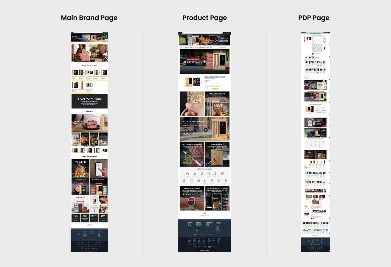
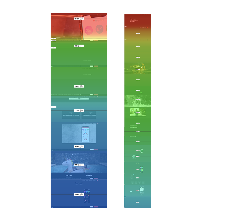
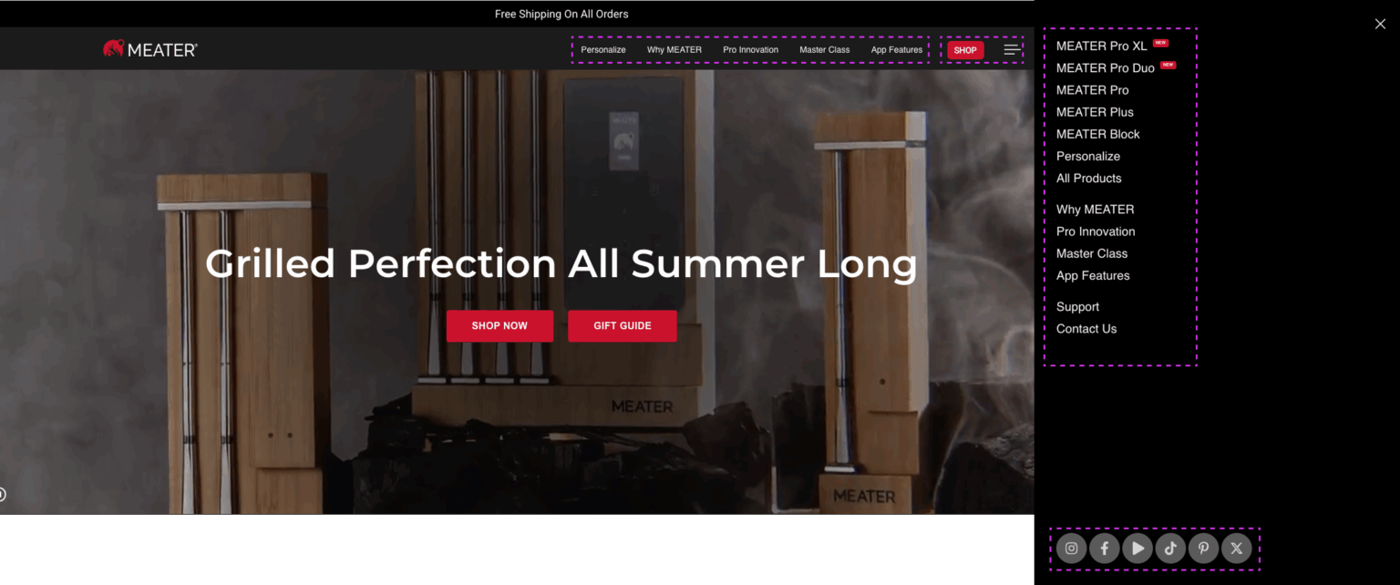
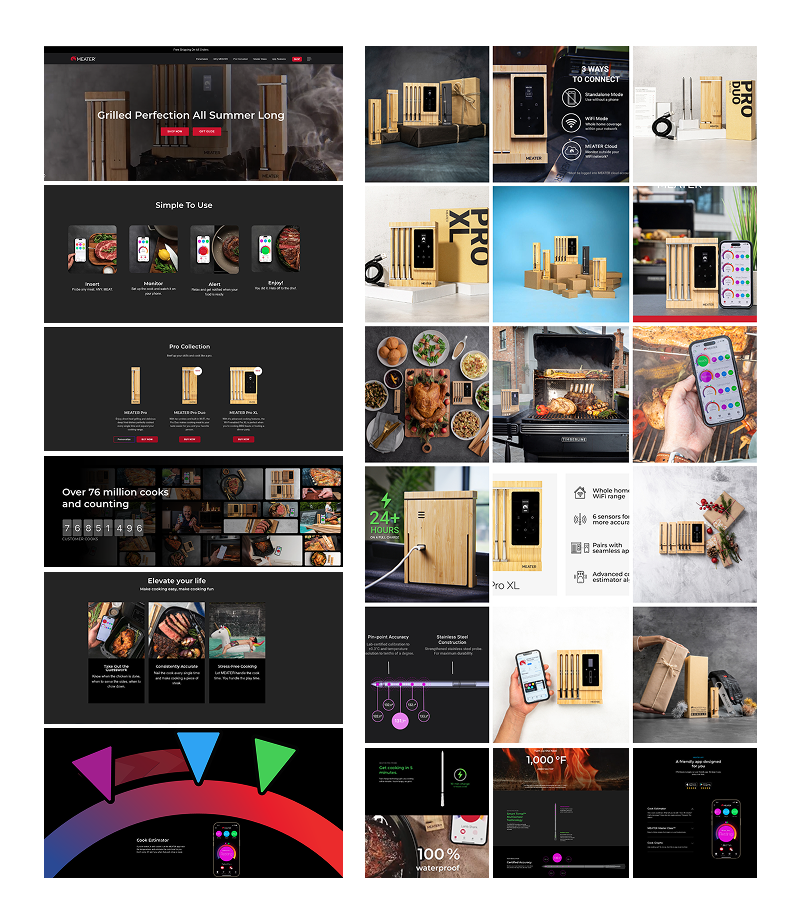
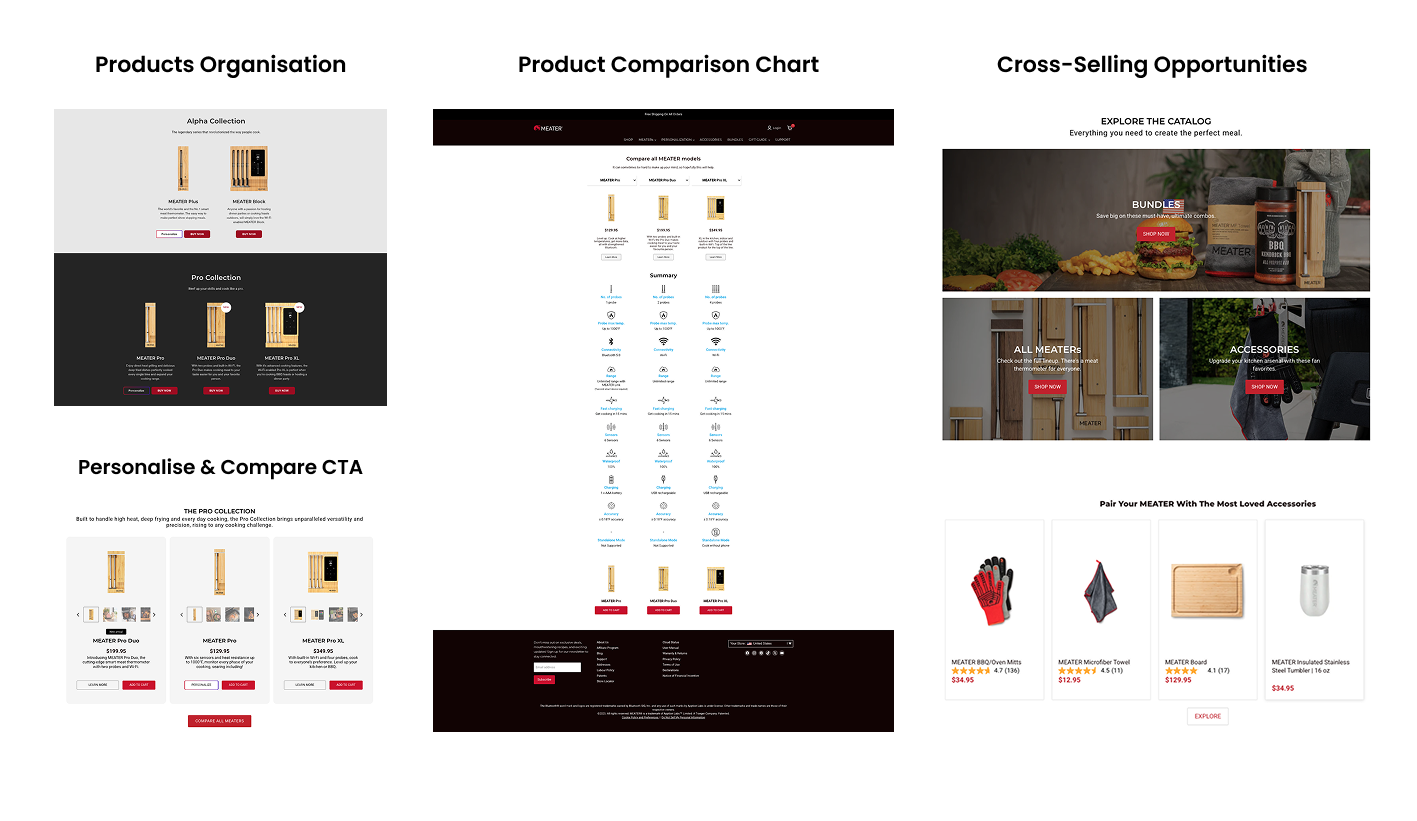
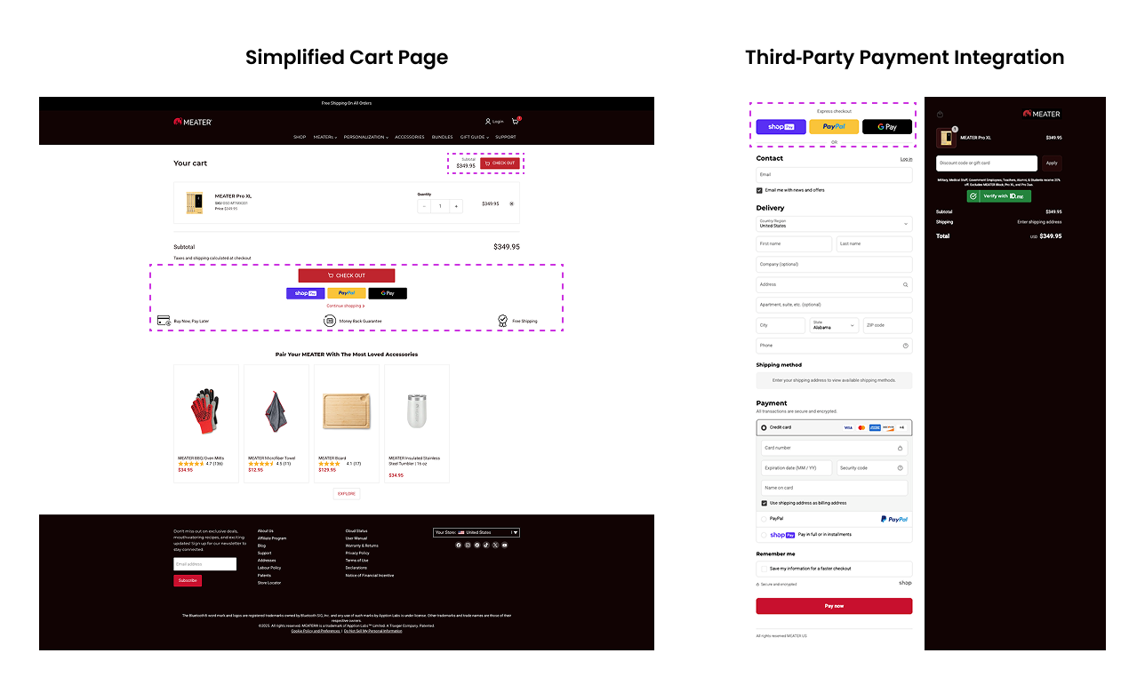
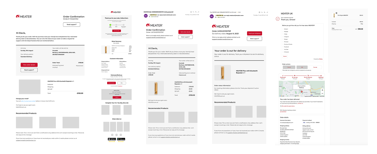
The MEATER.com redesign project successfully addressed critical usability, eCommerce store, and checkout challenges, as well as brand identity issues, by creating a seamless, engaging, and conversion-focused website experience. Through a user-centered design process—grounded in research, competitive analysis, and iterative testing—the new design enhanced product discovery, streamlined navigation and checkout flows, and reinforced MEATER’s premium positioning.
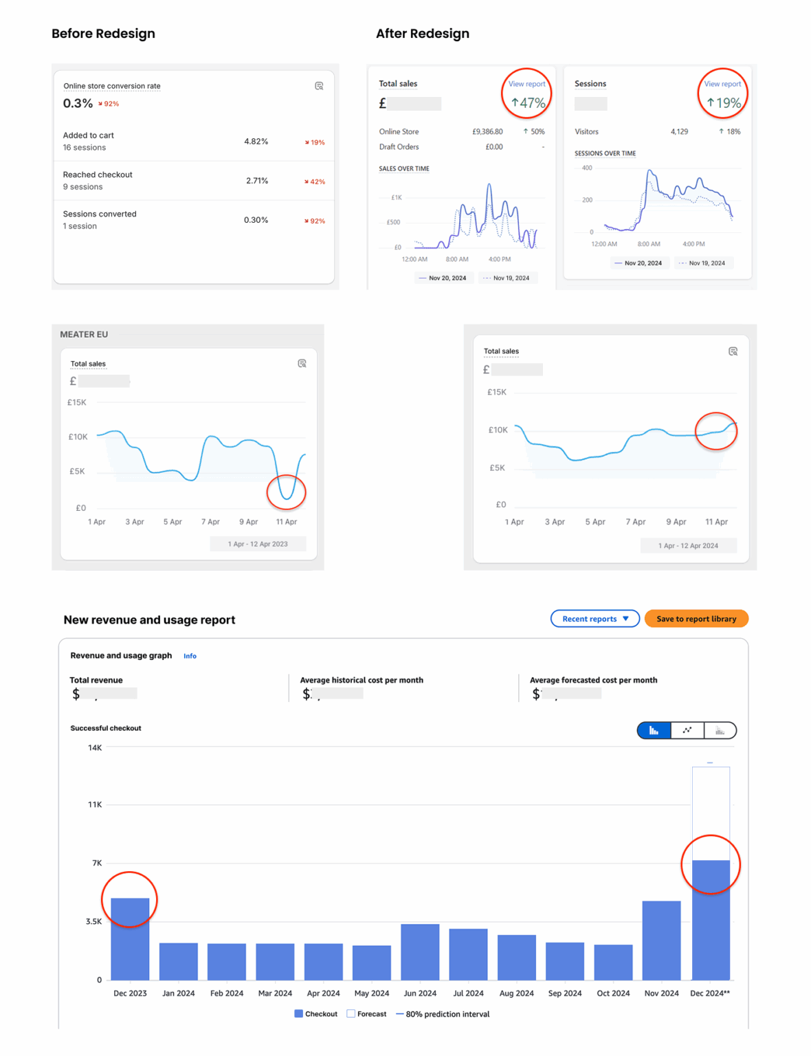
Key outcomes include improved user engagement, clearer communication of product benefits, and stronger alignment between business goals and user needs. The project also established a scalable and accessible foundation for future product launches, regional expansion, and ongoing eCommerce growth.
This case highlights the importance of combining data-driven insights with brand-aligned design to deliver meaningful, measurable impact. Moving forward, continuous use of analytics and user feedback will guide refinements and optimizations, ensuring MEATER.com and its eCommerce store evolve alongside its growing customer base.